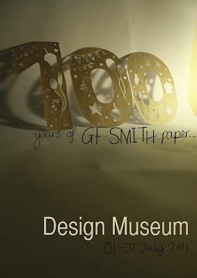
This is the first attempt I made at turning a photograph into a full on poster; unfortunately the photograph was landscape, so I had to use the clone tool to stretch the background up and down the page.. which in my opinion is a giant FAIL. lol
 |
| fail! >.< |
So I decided to just keep the photo its original size, but place it in the middle of an a2 portrait page; then I added a stroke and an inner glow to the photograph, and added some classy looking Helvetica for the font:
I chose not to make the font out of cut-out because I thought it would take away from the '100' which is designed, after all, to be the focal piece on the poster.
I also made a variant of this poster by changing the stroke's blend to 'dissolve' to see what difference it had:
 | |
| dissolved blend stroke |
You cant really see the difference though unless you see it really big :/
Next I decided to use one of the portrait photos; the one I liked the most from the collection; for a poster design. Like I said before, the photograph isnt completely flawless, you can see the edge of the backdrop.. but if I were to get rid of it, you would lose the composition of the photograph, the '100' would be centralised and I dont think that would look very good at all:
I decided that I would hand-draw some of the text on Adobe Illustrator (using only my MacBook's trackpad may I add, impressed? :P lol), to extend on the sort of craftlike effect given by the '100'.
I used 'Helvetica CY' for the 'Design Museum' font, a nice contrast to my handwritten type next to it.
I tried to play around with the contrast of the photo, to see if I could enhance it in any way, and the results werent very good; everytime I gave more contrast, it made it difficult to see the handwritten black text, and I wanted that text to be black, so I think I will keep the contrast/brightness as it is.
Personally, I think the flaws in my poster's photograph give it character; for example the background paper I used whilst photographing has a few creases in it; well I bet after 100 years any piece of paper would :P!
Finally, I decided to make one more alteration...
The position of the first half of handwritten text.. it just gives the poster more flow, and therefore more personality!
laine.x


No comments:
Post a Comment