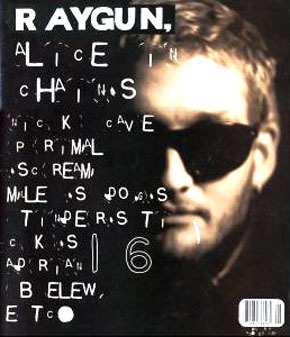
He was the art director for the magazine 'Ray Gun', an alternative-rock magazine based in California. The magazine was well known for its cutting edge and daring typographic design.
 |
| ray gun magazine |
 |
| jun/july 1997 - blur |
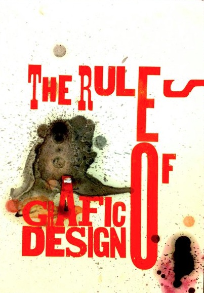
This 'free-ness' was also apparent in his poster work..
I think the way that Carson uses layering is really interesting too.
 |
| awesome! |
This poster is really cool, the use of grid structure is particularly good, and I love how the type has been made to look like lights.
David Carson, What a legend!
laine.x


No comments:
Post a Comment