Heyy. Please find my new blog for Print to Pixel here! <3
laine.x
Sunday 3 April 2011
Saturday 12 March 2011
poster designs
With my photographs taken of my '100' cut out, creating the poster designs on photoshop was only too easy :)
This is the first attempt I made at turning a photograph into a full on poster; unfortunately the photograph was landscape, so I had to use the clone tool to stretch the background up and down the page.. which in my opinion is a giant FAIL. lol
So I decided to just keep the photo its original size, but place it in the middle of an a2 portrait page; then I added a stroke and an inner glow to the photograph, and added some classy looking Helvetica for the font:
 I chose not to make the font out of cut-out because I thought it would take away from the '100' which is designed, after all, to be the focal piece on the poster.
I also made a variant of this poster by changing the stroke's blend to 'dissolve' to see what difference it had:
 I decided that I would hand-draw some of the text on Adobe Illustrator (using only my MacBook's trackpad may I add, impressed? :P lol), to extend on the sort of craftlike effect given by the '100'.
I used 'Helvetica CY' for the 'Design Museum' font, a nice contrast to my handwritten type next to it.
I tried to play around with the contrast of the photo, to see if I could enhance it in any way, and the results werent very good; everytime I gave more contrast, it made it difficult to see the handwritten black text, and I wanted that text to be black, so I think I will keep the contrast/brightness as it is.
Personally, I think the flaws in my poster's photograph give it character; for example the background paper I used whilst photographing has a few creases in it; well I bet after 100 years any piece of paper would :P!
Finally, I decided to make one more alteration...

The position of the first half of handwritten text.. it just gives the poster more flow, and therefore more personality!
laine.x
This is the first attempt I made at turning a photograph into a full on poster; unfortunately the photograph was landscape, so I had to use the clone tool to stretch the background up and down the page.. which in my opinion is a giant FAIL. lol
 |
| fail! >.< |
So I decided to just keep the photo its original size, but place it in the middle of an a2 portrait page; then I added a stroke and an inner glow to the photograph, and added some classy looking Helvetica for the font:

I also made a variant of this poster by changing the stroke's blend to 'dissolve' to see what difference it had:
 | |
| dissolved blend stroke |
You cant really see the difference though unless you see it really big :/
Next I decided to use one of the portrait photos; the one I liked the most from the collection; for a poster design. Like I said before, the photograph isnt completely flawless, you can see the edge of the backdrop.. but if I were to get rid of it, you would lose the composition of the photograph, the '100' would be centralised and I dont think that would look very good at all:

I used 'Helvetica CY' for the 'Design Museum' font, a nice contrast to my handwritten type next to it.
I tried to play around with the contrast of the photo, to see if I could enhance it in any way, and the results werent very good; everytime I gave more contrast, it made it difficult to see the handwritten black text, and I wanted that text to be black, so I think I will keep the contrast/brightness as it is.
Personally, I think the flaws in my poster's photograph give it character; for example the background paper I used whilst photographing has a few creases in it; well I bet after 100 years any piece of paper would :P!
Finally, I decided to make one more alteration...

The position of the first half of handwritten text.. it just gives the poster more flow, and therefore more personality!
laine.x
Friday 11 March 2011
photography for my poster
Much like the photographs of my 3D paper sculpture, I had to consider many factors when taking them, in order to ensure that I get the best possible photographs for my poster. Factors such as the aperture, shutter speed, ISO, composition (rule of thirds, leading lines etc) and lighting.
Like last time, the first photo I took was far too dark:


That's better! But I wasnt entirely happy with how I'd set up the '100', as there are cut outs, it would give more impact in a photo if they were casting a shadow; something which wasnt possible whilst they were lying down...
So I stood them up! (no, I didnt leave them waiting in a cafe lol :P)

The light issue again..
 I really like this photograph, however it was taken in landscape, when of course our poster has to be portrait..
 I think more shadow and more brightness can be achieved..
 This photo is great, but I think the 100 is too close to the centre of the shot; I'd crop it, but I dont want to lose the dimensions..
 I thought I'd try this angle out, but I'm not as happy with it as I thought I'd be. Although it is a good photo, I dont think it's perfect..
 THIS! is my photo!! The lighting is really good, and the shadows created are cool; the 100 is quite far up the page too which I wanted. The only thing is that there is a glimpse of wall on the right hand side, but I think that is easy to overlook :)
laine.x
Like last time, the first photo I took was far too dark:

So I simply decreased the shutter speed, like last time, to let more light into the camera..

and again..

So I stood them up! (no, I didnt leave them waiting in a cafe lol :P)

The light issue again..


laine.x
poster development - making
 | |
| dont worry, i used a spray booth, not the mac lab desk :P |
 |
| neatening up the edges |


 |
| cutting the shapes out |
laine.x
Thursday 10 March 2011
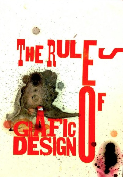
existing exhibition posters
As I am going to be creating a poster of my own, I thought I'd do some research into what else is out there by the way of posters. I've already looked at David Carson, but now I think I'll look into actual posters for actual exhibitions.
Starting with one from the Design Museum itself:
 I love the simplicity of the poster, it shows only the main image, without any other distraction, on a plain white background, simply stating the name of the museum on the bottom right, and the exhibition name/dates on the left.
 The photography in this poster is top notch, there's a great use of leading lines, really making you look from one side of the poster to the next.. you first see the name of the exhibition, then the date, and finally the location. It's really clever.
 This poster has a lot of information to display (there is a reasonable paragraph to the bottom left - probably a description of the exhibition), however the image has been kept as the main feature of the poster successfully, due to the use of appropriate font sizes etc.
A lot to think about but I'm now looking forward to designing my poster!
laine.x
Starting with one from the Design Museum itself:
A lot to think about but I'm now looking forward to designing my poster!
laine.x
david carson
David Carson is an American Graphic designer and typographer, who rose to fame in the 1990s as a result of his innovative work in magazine design and so-called 'grunge typography'.
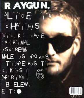
He was the art director for the magazine 'Ray Gun', an alternative-rock magazine based in California. The magazine was well known for its cutting edge and daring typographic design.
I really like the way the typography is so free and all over the place :)
This 'free-ness' was also apparent in his poster work..

I think the way that Carson uses layering is really interesting too.

This poster is really cool, the use of grid structure is particularly good, and I love how the type has been made to look like lights.
David Carson, What a legend!
laine.x
He was the art director for the magazine 'Ray Gun', an alternative-rock magazine based in California. The magazine was well known for its cutting edge and daring typographic design.
 |
| ray gun magazine |
 |
| jun/july 1997 - blur |
This 'free-ness' was also apparent in his poster work..
I think the way that Carson uses layering is really interesting too.
 |
| awesome! |

This poster is really cool, the use of grid structure is particularly good, and I love how the type has been made to look like lights.
David Carson, What a legend!
laine.x
Wednesday 9 March 2011
task 2 - gf smith poster ting.
For task 2 in this project, we have to create a poster celebrating 100 years of GF Smith Paper.
 The poster has to include the words:
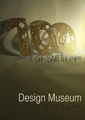
100 Years of GF Smith Paper
Design Museum
01-31 July 2011
So who the devil are GF Smith Paper?
Basically, they make (you guessed it!) paper, in all different shapes, sizes, colours and thickness.

Even though the company are 100 years old, their designs are still fresh as ever!

Good times, GF Smith!
laine.x
100 Years of GF Smith Paper
Design Museum
01-31 July 2011
So who the devil are GF Smith Paper?
Basically, they make (you guessed it!) paper, in all different shapes, sizes, colours and thickness.
 |
| 100 years old now, are they guys? ;) lol |
Even though the company are 100 years old, their designs are still fresh as ever!
Good times, GF Smith!
laine.x
photographing my sculpture
In order to make my sculpture look the best it possibly can, I will try and capture photographs of it to the best of my ability, taking elements such as composure (how well placed it is in the shot, i.e. rule of thirds etc), aperture, shutter speed, ISO and white balance into account.
Here is the first picture I took of my sculpture:

As you can see, it's really very dark, which although kind of looks cool, it means not enough light is getting to the lens in the camera; meaning I needed to change either the aperture or the shutter speed (usually the shutter speed)..

Now, this photograph is slightly too bright I think, so I have decreased the shutter speed a bit too much maybe, a quick change and..

Yep! Great lighting, finally. So once I had the hang of controlling the lighting, I took several more photographs from several different angles...

 |
| motion blur! :P |


 |
| nice and macro-y ;) |
 |
| my favourite shot :) |
 |
| it looks magical! :) |
laine.x
Tuesday 8 March 2011
creating my sculpture - how i did it.
As I had made a prototype model instead of launching right into creating my model, it ran quite smoothly at first..
I decided to simply times the dimensions of my maquette by two, to result in the sides of the model being approximately 320mm tall (120mm for the 'roof'), 180mm wide at the widest point and 140mm at the least wide point.
Only after completely measuring out this side of the sculpture did I realise I'd accidentily forgotten to include a tab at the bottom - FAIL. It didnt really matter though, I just used this one as a template and then drew the tabs on the consequent sides.


At that moment in time, I was worried that the structure wouldnt be strong enough, because of the large amount of surface area that had been cut out; but then I remembered that I would be re-adding this and more when I added the cut out section to the sculpture.
 I then measured by eye an approximate amount of paper to cut my design into, so that it would fix easily to the side, without any unsightliness, or gaps.

The final size for the piece of paper that I will cut my design into..

This is the design that I cut out of the sides of my sculpture; the whole way through this project I've been interested in implementing nature, specifically birds, butterflies and flowers, into my design and so I did just that. I copied the images of the butterfly and the bird off of images I found online, but I drew the flowers etc freehand..


The carpet in our flat took the brunt of it.. woops! Sticky sticky sticky!! You can see the outline of the cut out :P...


I decided to simply times the dimensions of my maquette by two, to result in the sides of the model being approximately 320mm tall (120mm for the 'roof'), 180mm wide at the widest point and 140mm at the least wide point.
Only after completely measuring out this side of the sculpture did I realise I'd accidentily forgotten to include a tab at the bottom - FAIL. It didnt really matter though, I just used this one as a template and then drew the tabs on the consequent sides.


At that moment in time, I was worried that the structure wouldnt be strong enough, because of the large amount of surface area that had been cut out; but then I remembered that I would be re-adding this and more when I added the cut out section to the sculpture.


The final size for the piece of paper that I will cut my design into..

This is the design that I cut out of the sides of my sculpture; the whole way through this project I've been interested in implementing nature, specifically birds, butterflies and flowers, into my design and so I did just that. I copied the images of the butterfly and the bird off of images I found online, but I drew the flowers etc freehand..

This version of the design, which I took a photo of originally, is a bit too simple and so, as you can see above, I changed it slightly.

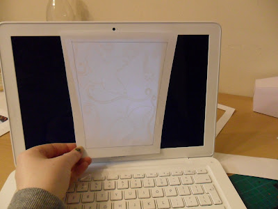
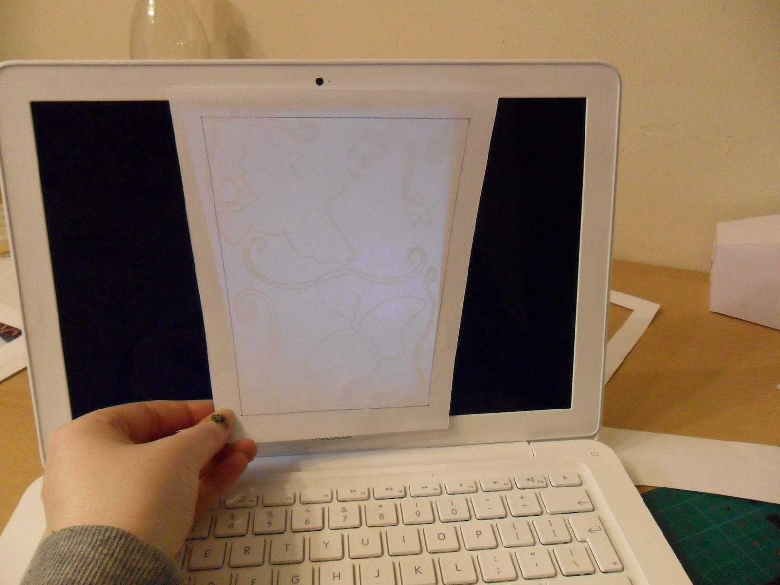
However, the reason why I have featured these outdated photographs is to demonstrate how I made sure that the design was indeed a repeat pattern on each side of the sculpture; I photographed the final design, heightened the contast on the computer and then traced it from the screen..
I had decided, since the brown paper looked nice that I would incorporate it into my design after all; but actually cut into it, so that the cut out sections appear brown from the outside :)
So once I had drawn the image onto the paper, I then measured out a piece of the brown paper to cover the back (the matte side of the paper)..


I then used spray-adhesive to fix the brown paper to the white paper firmly..


So then, I started to cut the design out of the paper, it took me a really long time to do the first one because I was wary of making mistakes; and after I had finished the first one, I had the worst cramp in my hand because of the pressure I had to apply :(
So I had to stop for a bit until my hand didnt hurt as much..

Me cutting away :P ...

Finished result..

So when I had made this one, I then went on to make 2 more (yep, only 2!). I had decided that the sculpture would look more interesting when hanging if there were more prominent angles; so I only made three sides, and the finished product is.......
Finished Sculpture.

laine.x
Subscribe to:
Posts (Atom)