Monday, 7 March 2011

development: maquette making :)

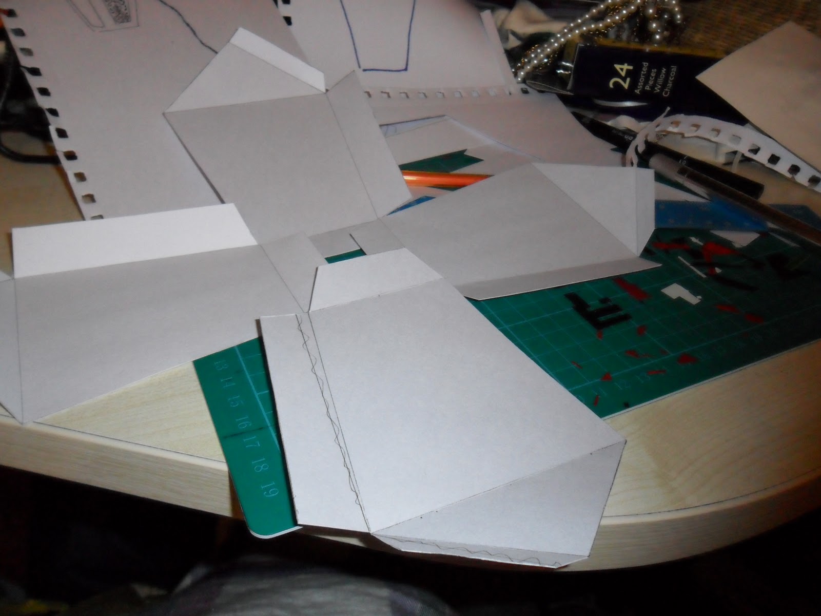
For my final sculpture I have decided to make a lantern-shaped sculpture, with the sides cut out, and replaced with paper that I have cut shapes out of for decoration.

In order to make sure my sculpture will be structurally sound, and that the concept will work in general, I made a mini version of what I wanted the sculpture to be like.

I worked out that for my main sculpture I wanted the dimensions of each face to be about 320mm tall, 180mm at the widest point and 140mm at the least wide point.

So I will make the developmental model at half the scale, so about 160mm tall, 90mm at the widest point and 70mm at the least wide point.

Here are the steps I took to make said maquette:

my measurements (approx)


I drew the dimensions of the shape onto the paper..

It looked like the structure was a bit too tall and wide, so I adjusted the measurements slightly..

Then I added some tabs, for sticking the structure together..

...


The flaps wont work properly if they're this shape, they need to taper at the ends to make sure they dont stick out anywhere and look unsightly.

This is one of the finished sides, so I then replicated it 3 times, and could begin making my maquette properly..

Now that the structure was made, I was free to design the pattern that I would cut out of the side panels..
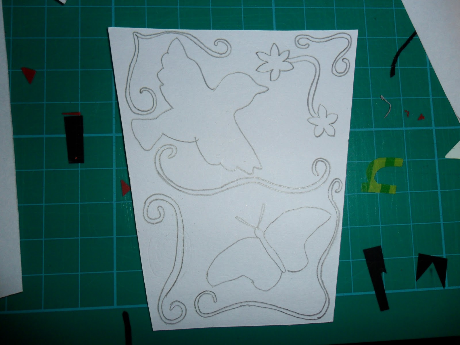
This is the pattern I designed for it, using the themes of nature that I have enjoyed researching the whole way through this project..

Measuring the hole for the cut out..

Cutting the hole..

How it will look..


Cutting out...


Below is the finished cut out, there is a slight fault in the left hand side; I have cut too close to the edge. When I do the real thing I think I'll make a border to avoid this happening. It shouldn't affect how the maquette looks anyway because I made the cut out slightly bigger than the hole it is going to be fixed behind..


The finished net will look like this (when the final side is added of course)..


When cutting the tabs, I'd forgotten to take into consideration that there will be a hole in each of the sides, and that any tabs would have to be small enough to not pertrude the hole..


 I then used double sided tape to fasten all of the tabs together..

But this was easily fixed by cutting the tabs :)

Unfortunately the 'roof' of the sculpture didnt fit together, this is because I'd made the section of the model smaller as I thought it looked too big! Whoops!


All of these mishaps are expected in a prototype model, and that is the sole reason why I made a prototype; so that I didnt make these mistakes when manufacturing my final piece.

Finally, I found some brown paper and thought it would look nice to include it in my design, as the colour looks really nice with the white; giving it an extra edge...


Now to make the real thing!

laine.x

Sunday, 6 March 2011

secondary research - helen musselwhite

Helen Musselwhite is an extraordinary Manchester based, illustrator turned paper artist. Her work is right up my street, as she incorporates nature into almost all of her work, using the elements of nature I find particularly alluring.

'White Butterflies' - Helen Musselwhite
I really like the detail used in the pieces, and the compositions are amazing. Even in the above piece, Musselwhite has managed to make a primarily white sculpture look textured and interesting as!

'Butterfly Garden' - Helen Musselwhite
The use of layering in this piece is great, too! The black contrasts with the pink really well.

'Butterflies' - Helen Musselwhite
The above piece, simply named, 'Butterflies', is quite similar to the other white papercraft further up, but this one gives the illusion of hidden creatures within. Everytime you look at this piece you spot something new, which is cool.

'Beauties Butterfly' - Helen Musselwhite
This is a wall hanging, in the shape of a butterfly, but encasing different scenes of nature; all made from paper.

I've found Helen Musselwhite to be really inspirational, and I'd really like to incorporate something similar to her work into my project.


laine.x

Friday, 4 March 2011

primary research - winter gardens.

I recently went to the Winter Gardens and took some photographs of the plants there, as they show great repetition (in a good way), but also as theyre one of the purest types of natural form!


I can see a lot of repetition in the above plants, be it form, colour or shape..


Some of the flowers and plants in the Winter Gardens are lovely, and whilst there, I also saw a small fashion exhibition based on the stages that take place for the human lungs to develop and function; so I took some photos of some of the dresses that were in the exhibition, which I thought showed repetition or natural themes quite well.

This dress is showing how the lungs have taken their shape within the human body, and to show this, the dress has a pair of wings, which features a green set of lungs. The wings look like that of a butterfly, which is fitting, as they are one of the creatures I'd like to look and feature at in my project somehow.

This dress represents the formation of the spine, and the vertebrae in the spine definitely have a repeating pattern of sorts, and they all fit together in a certain and specific way.

Lots of natural inspiration there!

laine.x


Wednesday, 2 March 2011

butterflies, birds and nice things.

I really like the idea of incorporating birds or butterflies or flowers into my design for some reason, no idea why! I've just been drawn to them..

Last year my friend Anna bought one of Rob Ryan's books and she showed it to me, and said it had been really inspirational to her (she studies Contemporary Crafts) and that I'd like it too. Thinking back to it, I really liked Rob's designs, some of them are extremely beautiful.

I've always been into quite quaint and traditional/handmade looking design, I love Cath Kidston's designs for example, and Rob Ryan portrays this in his work too..


I love the type/illustrations that Rob creates, they're really interesting and unique looking.

Below is an image I found on the internet (from a Blogger user actually):


They're birds made from Japanese paper, I think they're incredible and I'd love to make something like this, but I have the feeling that unfortunately it wouldn't be acceptable as work for this module as they're not exactly 'sculptures' as such.

Another sort of paper bird I have found on the internet are these adorable creations:


They're sculptures of birds made from recycled papers, like book pages or maps for example; stitched together with embroidery thread, and given wire feet. I think they're adorable, and would love to make something similar for my project, however I dont see how I'd be able to differ it very much from the original design, so that idea is out of the window..

I've also come across the company 'Lladro, who are based in Kent, UK. They don't work with paper, but they have created some amazing sculptures in the sort of style that I have grown to love.

For example, this is a fibre optic, made to measure Lladro 'Niagara Chandelier':


It consists of 300 identical porcelain fairies that are about 3 inches tall, and it would cost about $90 000!! Awesome repeat pattern right there.

I'd like to make a paper sculpture running somewhat along these lines, so these discoveries have been really inspirational.

laine.x

Tuesday, 1 March 2011

secondary research - matt shlian


I have come across an awesome american paper artist & engineer, called Matt Shlian.

He has produced some amazing pieces of work over the past 10 years or so, creating normal paper sculptures in the still form but also creating kinetic paper sculptures (moveable). 

 
click here to play, then press the back button to return to my blog.
The sculpture shown below is very elegant, and reminds me a bit of Richard Sweeney's work and some of the work that was produced by my coursemates in our workshop sessions.

'C1' - Matt Shlian 2008
'Metro Times' - Matt Shlian 2006
I really like this one above, 'Metro Times', because of the use of everyday newspaper to make a sculpture, I personally find white paper sculptures a bit plain at times, and it's refreshing to see different media being used.


'Misfold at the UICA' - Matt Shlian 2009
I love the above piece, it's one of Shlian's 'kinetic' pieces. There are two identical folded paper sculptures, each of which fold down into what looks like a stack of paper, and fold out to reveal a beautiful, intricate design. In this piece, you can see one paper being unfolded, as the other is folded, and vice versa; the sculptures are being controlled by robotics which are in turn, pulling on strings.

I really like Matt Shlian's work, I've found him really inspirational and I'd love to be able to produce something like this.

laine.x

primary research - tudor square.

On my way into town after University today, I walked past Tudor Square, where the Lyceum Theatre is; and I noticed some of the benches and flowerbeds look like sculptures themsleves, so I took a few pics:


Quite a lot of organic shapes are being used here, because of the curved lines & the circle on the right hand side of the flowerbed, I can see a sort of fish in the stone. However from a different angle, I'm sure it looks completely different..


I think this stone is interesting, the cut out section leads you to believe that the inside of the stone is in fact made of gold, even though the stone looks like an ordinary one (with only traces of gold running through the surface, hinting at the inside's contents).. perhaps you shouldnt judge a book by its cover! I like the shape of the cut out, and I think this could be achieved by scoring and folding paper..

I love the lines in this piece of stone, it could easily be replicated in paper using scoring and folding :)


The below piece of stone has cleverly been made to look like wood, which is encompassing with the wooden bench that has been set into it..


Good times! :)

laine.x

primary research - sheffield library

I recently vistited Sheffield Library, and when I approached the stairs, I noticed that there was a piece of art, hanging through the gap in the centre of the staircase from the very top of the stairs right to almost the floor.

The piece was made by Seiko Kinoshita, a Sheffield based Japanese artist; and here is the explanatory description that's next to the piece:


The sculpture is made from 'paper yarn', and each individual 'bird' is the same shape and size but as you go further up the stairs the colours change..

The birds start at a deep purple colour, perhaps because in that part of the stair case it's a bit boxed in and there isnt much natural light, so the birds are a deeper colour; you can then see the birds turning into a blue colour..

Then from the darkish blue colour, you can see the birds turning back into a lighter (lilac-y) shade of purple..

From the lilac-purple, the birds again turn again, into a lighter shade of blue; but more gradually this time..


Until finally, white is introduced as the top-most set of birds, as they are the most exposed to light perhaps? You could also argue that as these birds are very high up, they could be recognised as doves; heavenly birds.

I really like this piece, especially how if the 'birds' were placed alone, they'd not necessarily look like birds, however as they're in a 'flock' it looks very realistic, and I'm lucky to have found such an interesting and true form of repetition.

The frayed edges of the material conveys motion really well, especially when the birds are moving with natural breezes.

laine.x